Review: Tora, Tora, Tora! Eduard's New A6M Type 21 Zeros
Today I received a shipment from Hannants with Eduard's first release of its A6M Zero series. Think of what Eduard has accomplished during this time of the Covid Pandemic: continued their Bf 109 series, made good progress on the early Merlin Spitfires, and now a two-kit boxing of the Imperial Japanese Navy's early-war miracle fighter.
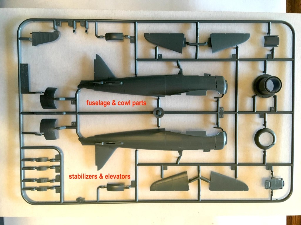
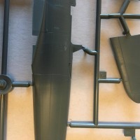
The moldings are what we have come to expect from this Czech company. There is a minimum of flash, the panel lines, inspection panels, and riveting are incredibly fine - maybe a bit too fine in some instances, and the cockpit detailing is exemplary if you have the fingers for small photo etch parts or positioning well detailed decals.
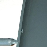
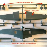
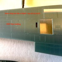
The photos show a few of the features Eduard has lavished on this release. I'll leave it to the real experts to fill in the parts I've not shown.
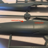
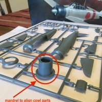
As with any kit, some questions do arise. The riveting on the top wings is noticeably finer than on the bottom. There is a mandrel to guide the placement of the several cowl parts, and Eduard has several reminders not to glue the parts to the mandrel, but I wonder about structural integrity. At the rear of each wing fillet there is a raised panel that I've never noticed before - neither have Otaki, Tamiya, or Hasegawa. There is a PE part for each main landing gear that goes on but then never again shows in the instructions. Eduard provides color call outs for Mr Color, Mr Hobby, and Mission Models paints, but apparently none has a satisfactory Mitsubishi interior or exterior color without mixing except for Aotaki. The assembly alignment pins and holes are incredibly small.
On the beyond simply good side, the engine is complete except for wiring (no Fw 190 flat plates), and the extra unused parts include a nice bomb rack for those who want to build a late-war special attack version. The decals are in register, look to be more heavily inked than some earlier releases that drew complaints, and include a color variety that features two shade of red, one for the Hinomaru and another for the ID bands.
This kit helps you to see how much work went into its design and realization, and also how much Tamiya and later Hasegawa put into their earlier kits.
The instruction booklet has a brief description of the planning and execution of the Pearl Harbor Attack, and the markings schemes feature pilots who played an interesting role during the earl war years. One even survived.

Thanks for the preview. Can't wait to get one.
I'm waiting for this kit too. Looks good. I still think Tamiya dropped the ball when they stopped their revamped modernized Zero series after the A6M3.
As for Mitsubishi Interior, I like the pale green Tamiya XF-71 but I've seen pics from old wrecks of the interior color as a bright yellowish green. In my limited understanding, the yellowish color is XF-71 sunfaded/aged/oxygenated.
The raised panel on the fuselage is there on the Zero out at Planes of Fame.
Thanks for sharing Christopher @brummbaer
Definitely would like to have one as well and compare it to the Hasegawa Zero.
Thanks for sharing this great info, Christopher!
You raise some interesting facts about this new kit Christopher, some of which I had not seen written by anyone thus far, but the “issue” about Eduard’s traditional paint brands call-out options is a miss imo. Every kit maker has is own choices of paint brands, and often the correct shade needed for this and that is not available in their catalogues either.
Fortunately there are options out there that enable the modeller to paint a Mitsubishi or a Nakajima factory made Zero-sen without the need for mixing paints. And I do believe Mr Color has the correct shades for either cockpits in their chart, and MMP has the Mitsubishi at least.
Pedro and Lis, I'm sorry that I did not make it clear that the Eduard kits and schemes are all Mitsubishi-built Model 21s, so Nakajima colors have no bearing on the subject.
Matters of Japanese colors have been in flux for the 50+ years I have been seriously modeling. Few experts whom I've read and communicated with agree with any but the most basic degree of certainty on even the most basic colors. I have the Vallejo sets, the older AK sets, some Model Master and AeroMaster colors that are still usable, most White Ensign, and a few other older random manufacturers going back to Poly-S's takes on Thorpe's interpretations. AK has even just released new formula sets with slightly to substantially different colors. As a matter of personal preference I do not use Mission Models Paints, and anyone in the continental USA willing to pay the postage can have the too many bottles I do own. On a slightly different path, it's amazing how carefully many decal makers have avoided the deep yellow of Japanese markings in favor of a pale yellow, often with a sickly greenish tinge.
I have books ranging from Tom Thorpe and Ian Baker through the Monogram titles to H. C. Bridgwater and Nicholas Millman' contributions to Combat Colours, plus several of Millman's excellent PDF files. I stand amazed by their diligence and their disagreements.
My comment was only meant to indicate that Eduard was being no more or less helpful or authentic than anyone else with their color call outs and mixes, though the box art is probably within 95% accurate. Eduard doesn't use the same mix ratios as Hasegawa for the same paint brands. The above experts don't agree on the same FS color matches. One can only hope that the more recent authors are basing their opinions on more and better data and that the modern paint manufacturers will continue to improve their color matching and consistency.
Tom, on re-examining the old Tamiya kit, it appears (feels is actually the better sensation, as that's how my attention was surprisingly drawn to Eduard's difference) that T tried to mold that raised panel, only not to the degree Eduard did and thus not nearly as noticeable. Both T and Hasegawa molded recessed panel lines for the panel, but H didn't raise the panel at all, at least in the earlier molding with a mix of recessed and raised panel lines.
I hope that panel (those panels) aren't artifacts of a restoration process. In looking through period photos and definite restorations, I can only imagine that that raised panel is indeed raised, as shadow, graininess, angle, contrast, or distance makes it invisible to my old eyes.
A word of warning to all, some parts have what are called "finger" or overlapping injection gates. Due to Eduard's critical mating tolerances, you will have to be very careful trimming these gates from the mating surface.
On size and scale, the Eduard kit is marginally bigger than the old Tamiya kit by about 1.5mm on each wing (<3mm total), and ever so slightly longer in length, cowls aside, the Tamiya kit being supposedly 1/50, and the T's headrest seems to be placed a little farther to the back. The Eduard kit looks to be the same span as the Hasegawa, with the fuselage length also the same, cowls excepted, and the headrests look to match in location. The basic shapes are similar enough considering the kits' ages. Riveting and other levels of detail aside, all three kits will look OK side by side unless you place the E and T kits so as to emphasize their slight size difference. Cost aside, you'll probably want Eduard kits for detail, Hasegawa for basic considerations like building a series of Zeros, and Tamiya only for modeling "fun" and convenience.
I think good choise is Nakajima Interior Green from Mr Color
Most useful 🙂 Even though it's mostly a "quick look", I have gladly categorized it as a Review... hope ok.