1/48 Italeri AH-1W Super Cobra
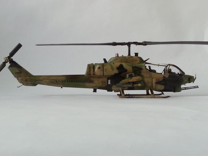
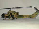
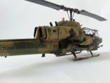
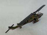
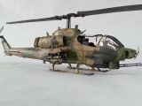
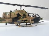
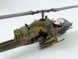
This is my Turkish Army AH-1W Super Cobra from the Italeri's 1/48 scale.
The build was for a very close friend of mine, -better to say brother in arms-, who flew with the W in the Army more than 15 years and retired with the rank of Colonel.
I tried to depict the early version of the Turkish Whiskey before the NTS upgrade along with the ASELSAN avionics & ECM upgrades.
The project was pretty straight forward and the kit was not super hard to build apart from the main rotor blades.
Had the blades been glued according to the plan, the outcome would be a main rotor rotating in the false direction. The original W blades rotate counter-clockwise, however the kit provided rotor rotates clockwise. So, I had to cut the main blades and glue, fill, sand several times in order to achieve the desired effect. This is my sole notice to the fellow future builders of this specific kit.
I used Cobra Company's resin cockpit set and Werner's Wings 2-tube TOW launchers.
Just like almost any other time with my rotary wing kits; mesh and wires were used to enhance the realism.
After priming and pre-shading, I painted the kit with Gunze acrylics, finished with Future+Tamiya Flat Base mix.
Apart from the downside of the blades, I would recommend the kit for its size and engraved panel lines.


That turned out VERY nicely, Emre...good catch on the rotors (I doubt I would have noticed). That paint job is outstanding!
Great build
Looks great. one mean machine.
Nice Cobra! The camo scheme is really cool. I built one and read up about the rotor direction a little too late. Very nice build though, one of my favourite helicopters.
Very sleek and menacing, just like the name. Maybe a little additional lighting would bring out the details a little more (my modelling room is like Sun City for old eyes ?) but the execution looks great.
Very nice! Agree with Rob about lighting - would love to be able to see more clearly, as it looks like a stellar build and finish job! These tired old eyes just need a bit more help...
Thanks for the comments guys!
Right about the lighting issue. I don't know why but, the actual photos are lighter. I'd realized the darkness after the upload. Maybe just due to the site settings.
I hope my follow-on uploads will be less tiring for your eyes;)