Late War cat is done!
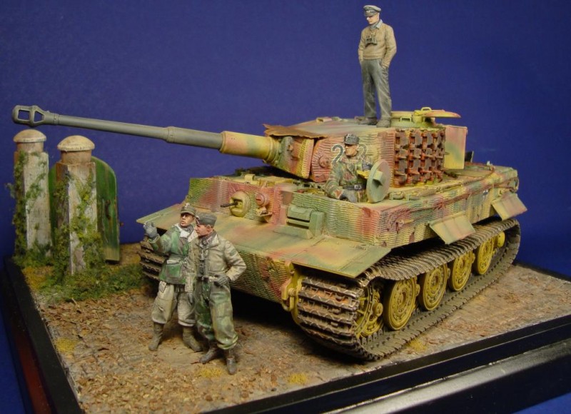
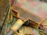
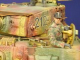
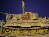
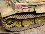
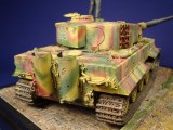
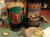
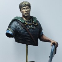
Here she is, AFV Club Tiger I late production (built spring-summer of '44, I'm not going to be more anal than that!) with Dragon details and Fruil tracks. Figures are Alpine, Master Box and the guy in the drivers hatch is a "Frankenstein" from the spares box. She is a "representative" build from Kampfgruppe Hummel in the area of Esldorf Germay, spring of '45, meaning I did not try and build a specific tank, but one that is representative of Tigers from that unit after the Bulge during the retreat across Germany. At least 2 Tigers from this unit had extra guards welded on the turret over the MG port, gunners sight and a rain guard over the gap between the mantlet and turret. The welded rain guard on the turret top I decided to do as a piece of raw thin steel that was starting to rust. They may have painted these, but in my mind the crews would have had little time or supplies to do painting. Lastly as is my tradition I have a lovely smoked porter from Alaskan brewing company in the Bobba Fett pint glass my daughter gave me for Father's day!
Great build Rob, I like the rust effects, Figures. I like everything. What I would like though is a drop of that brew you got standing next to the turret.
Cheers, a great build.
Excellent build Rob….truly a magnificent canvas showcasing your multiple skills and talent.
Really nice, Rob. Figures look great, too.
I agree...the weathering and details really make this dio a "looker" - nice work all around, sir.
Nice work Rob, some excellent subtle touches and convincing weathering (the rusted rain guard looks great).
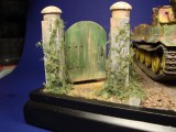
Its about time someone displayed some armor around here. Outstanding work all around. I especially like all the small details such as the pull string on the gate. Still, why not just walk around? Anyway, it all looks great even if the tank commander looks as though he misses his U-Boat.
This has to be one of the "nicest" boards...it seems to the favorite word these days. Will break from that adjective. I like the tonal values and intensities of the colors on the figures and tank. The colors are all balanced as if everything is in the same environment. The figures don't look like they pulled there uniforms off the rack at J.C. Pennies and the tank doesn't look like it was driven off the assembly line. The photos are clear and sharp and help define or direct the viewer to whats important and help develop the idea that the figures and the track have mass. I also, like the dio's gate with the rope.
Several niggles and small ones at that, if your running a tank on a hard surface ...like a cobbled stoned road the raised surfaces of track links would have more of a bare metal surface. Two, I would place the Dio on a bigger base. A bigger stage to invite the eyes to look at the tank,crew, stone work and gate. The base or the photos seem to crowd your subject, which is superbly done to perfection I might add. This is free advice that can be filed in the round cabinet.Located at the bottom corner of your desk.
On the whole, its two thumbs up Rob.
Great build Rob and a good drop of the falling down liquor too by the looks of it.
Well done mate.
Thanks guys and Stephen you are correct bout the size, as I went on I realzed it was a bit crowded, better planning up front would have helped, but by the timeI decided it was too small I was too far in to want to start over. I did take the tracks to bare metal as well as shining up the surfaces of the road wheel, it is my photography skills that let me down there!
The tracks are a subjective matter when it comes to modeling ...after looking at some period photos I've seen some shiny tracks,in between tracks and muddy tracks. Your photography skills are pretty solid Rob.
I like the Zimmerit (probably miss spelled) chunks that have fall off the tank too. The Porter looks good ...
I strongly disagree with Stephen. This vignette does not look crowded at all, as a matter of fact, it looks just right. I model by the philosophy that less is more. More space means having to add more stuff and taking away from the main subject. Leave it as it is, it is spot on!
that looks terrific
Some interesting comments above, Rob, more everyone seems to agree you've done a fine job, and so do I, so, "cheers!".
Superb work Rob. Love it!
I'm not a tank builder but if I were, your model would be the standard to emulate. Great job on the figures, too, I avoid figures in my models at all costs!
Super work Rob the whole tableau looks excellent particularly the figures and their relationship to one another and the tiger itself