Gabreski’s P-47 – another take
Following the iModeler Rule- don't post your take on the same model on top of someone else's on the same page - I waited over the weekend from my planned Friday post, so as not to detract from Scott Nelson's very nice take (now two pages away) to post my take on this well-known airplane.
To start, for an airplane as well-known as this, it is very poorly documented pictorially, which has meant over the past 50 years - since Monogram first released their "bubbletop" with these markings and the airplane as the boxart - that many modelers have tried and many have not been successful at cracking the mystery of Gabreski's Thunderbolt. From my first attempt to do this back when that kit was new through three other tries, I didn't get close. But over the past 15-20 years, more research has become available. Plus I got to talk first-hand to The Man Himself 20 years ago, who turned out to be one of the few pilots I've ever interviewed who had any detailed personal knowledge of what his airplane looked like.
In May, 1944, the 56th Fighter Group began applying in-the-field camouflage to their NMF P-47s in anticipation of the coming invasion. All were done with RAF paints (as were all other in-the-field camo jobs in other groups; it was what was available) and most were done in an "RAF style" two-color disruptive pattern of either Ocean Grey and Dark Green or Sea Grey Medium and Dark Green. It has been fairly established by researchers (I confirmed this talking to Hub Zemke in 1984 and Gabreski in 2001) that the undersides were left unpainted. That's because painting an airplane "in the field" sitting on its gear isn't easy, as Merle Olmstead once pointed out in talking about the painting of 357th FG P-51s. Mistaking the lower surfaces as being painted a light grey is easy if you consider that aluminum exposed to the elements does "go grey" over time, and a black and white photo can easily lead to an incorrect analysis. Vallejo has brought out an interesting metallic color "Dull Aluminum," which does indeed dry with a "grey tinge", which I used on this project. I think it proves the point when viewed.
While everyone else was doing "RAF style," Gabreski asked his painters to do a "Luftwaffe style" camouflaged with one of the colors "blotched." Study of the available photos will clearly show this, most obviously the close-up shot of him getting out of the cockpit. Study of the two shots from the left side also show that the grey paint that was applied over the dark green was applied around the ID letters (I had to go back around the decals once applied to insure this). Study of the shots the Germans took of the airplane after it crashed, when the upper D-Day stripes had been removed, also show the area where they were to be Dark Green originally, with some new areas of Ocean Grey blotched over; this is useful in determining that it is indeed the case that the fuselage stripes did not include black - at least initially - as is also shown in the two shots of the airplane from the left with the stripes applied. Also, the one color shot of the airplane does confirm that the upper grey is dark enough to more likely be Ocean Grey than the Sea Grey Medium some decal manufacturers have called out.
There is only a short roll of motion picture film that reveals the markings on the right side of the airplane. One reveals a larger area of Ocean Grey blotching on the fuselage than many assumed. The other, which shows the upper right wing, reveals that there were (at that time) no black areas of the upper stripes, since the area between the stripes is the same tone as the areas inboard and outboard of the stripes. The lack of upper wing black stripes is also indicated by looking at the "famous" shot of the airplane, taken from 10 o'clock low, which shows on closer examination a line of "dark and light" along the leading edge of the wing for the area of the black lower stripes.
Unfortunately, most decal makers haven't gotten all this in their painting and marking instructions. The Techmod sheet (the first to get it right about natural metal) that I used calls out Sea Grey Medium for the upper grey, and the upper camouflage pattern they provide is not congruent with the photos (not to mention, their national insignia decals for the fuselage are too big, something "discovered the hard way" in this project - thank goodness for the kit decals).
Another small but important thing is that the serial number on the vertical fin was done with a stencil, and a narrow "overspray" of yellow around the stencil can be seen outlining the serial. I did this by taping over the decal with drafting tape, then"spotting" yellow around the edge with a 0000 brush.
The important thing to remember is that the airplane was "a work in progress" during the eight weeks Gabreski flew it before he downed himself on July 20, 1944. Thus, the closest anyone can get to anything "definitive" is a representation of the airplane at a particular point in time so far as the markings are concerned.
One final interesting point was made to me by a good friend who pays attention to such details - that unlike almost all other 56th Group P-47s that show up in Jeff Ethell's "World War II in color" books, Gabreski's airplane wasn't polished. I have since "dulled" the model in light of this information.
So, here's my take on the airplane, with the research photos included for review.
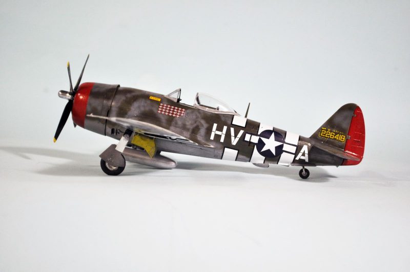
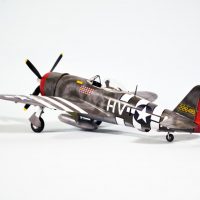
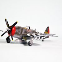
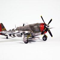
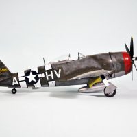
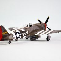
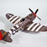
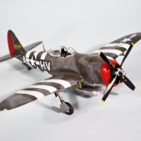
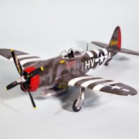
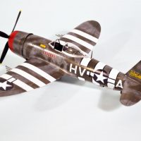
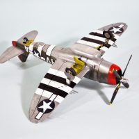
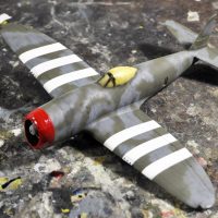
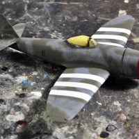
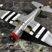
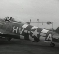
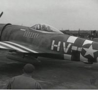
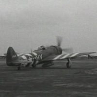
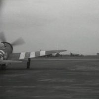
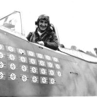
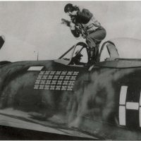


Trying to decipher a black and white photo is always interesting. Once you find a small gap you can pry open a bit, the revelation can be fantastic for the understanding of how to read the information one actually sees.
I usually ad a few drops of light grey or white to Vallejo´s metallic colours to add that oxidised look you may be talking about.
That works too. This color was a recent addition (at least to me) I spotted over at the LHS.
Yes indeed, decoding black and white photos is difficult. My all-time favorite is the Very Famous Modeler who declared 50 years ago when Airfix did their big Hurricane and he wrote their "how-to-build-this-monster" book, in which he showed alternatives one could create, that the now-famous Sea Hurricane "Nicki" of 825 FAA Squadron was "all white." This despite including other shots of the airplane that clearly demonstrated to anyone who cared to take the time to look that the white was overpainted on the standard FAA scheme, with the white wrapped around the leading edge of the wings and the lower surfaces left Sky. The mistake was then compounded by another "hex-spurt" in the Squadron "In Action" book, using the same photos, and declaring that a shot that clearly demonstrated the white was oversprayed over the national insignia to "cloud" it, was "out of focus", this despite the fact that everything around the airplane visible in the photo - people, deck, etc. - was clearly in focus. If you're going to make a mistake, you may as well make a big one, and if your reputation is big enough, the next copy-and-paste "researcher" won't bother to question your "conclusion."
Nice work Tom, and your article gives some insight and justification for your interpretation which looks really good. I did his plane in the Monogram kit years ago when I had the plan to build as many of the 56th FG that I could. This was before decals were available and I had to paint everything. More recently I did Ole' Cock III with the Tamiya kit, and just by chance a good friend did the same bird in 1/32 at the same time. It was so fun to set them side by side and see how two people interpreted the information and pictures we had. They were clearly the same bird, but yet distinctly different.
Would be fun to see all the different Gabreski birds together and see how everyone saw the same thing little differently.
Again Tom, Really nice work!
What was Gabreski's rational for painting a Luftwaffe style paint job? Ease of painting or to temporarily fool a German pilot into thinking a Jug looked like another 190 or 109? Early P-47's where mistaken for Fw-190's and where painted with white cowling rings to avoid such confusion. Later in the war things changed.
It looks as if the top sides where paint with RAF green. Green covering the wings and the upper surfaces of the fuselage and then the gray was over sprayed lightly over the green. So now we have to title are model as pre-crash and post-crash ? Yes like the pilot aircraft aircraft evolve and change.
Hi Stephen,
I think the reasoning was that Luftwaffe Fighter camouflage was “air to air” while RAF/USAAF was more “air to ground”. The 56th was still very much in the “air to air” bidness and any advantage gained on being the last seen and therefore first to kill was definitely seized.
At least that’s what I think, others mileage may vary.
I'm sure that would have fit. There's also the fact that the three guys who opted for this scheme were the three leading shooters in the group, none of whom were shrinking violets, and a distinctive scheme known in the group would work in their favor in who shot what.
Tom you said it, no shortage of ego’s in the 56th. On that note I heard a “war story” that when Gabby’s prop nicked the ground resulting in his missing his flight home, he was filming his strafing run for proof of his “ground kills” with a handheld camera. Supposedly he was “upset” that he had been denied credit for some ground kills due to no gun camera footage, on an earlier mission.
Great job, Tom, after your meticulous research.
Really nice build Tom. As usual I enjoyed the info as much as the model.
This build came out fantastic, Tom.
I really enjoyed following your building progress.
Great model, Tom. I’ve always thought the 56th was DG//OG over bare metal. You actually got me thinking about these planes again when you mentioned that the Philippines based P-35s had unpainted undersides. I’m on a bit of a Seversky/Republic kick this year and want to do Albert Knafelz’ “Button Nose”. I’ve seen a color photo of that one that clearly shows a bare metal gear cover and leading edge of the left wing. I’ve also thought it odd that some decal sheets recommend MSG instead of OG. Anyways, nice work!
Thanks! On your recommendation I got that Wolfpack update of the HC P-35A and am going to do it as Lamar Gillet described them.
That is really well done Tom, nice touch with the overspray on the tail numbers too. Looks awesome dude!
Super job on this Tom. The camo really looks good.
Yours is the best interpretation I've seen to date, Tom. The distinctive demarcation between topside Green and Gray, Green sprayed first followed by Gray giving the Gray that particular tonal look, stencil overspray on the S/N, down to the canopy rails being NMF since they likely closed the canopy and masked-off the whole shebang before spraying the topsides. Nice, nice work.
Flattery will get you everywhere sir! 🙂
Well, sure, if had had the chance to talk it over with Gabreski... I tip my cap to your take, Tom. A beautiful model.
Good stuff Tom. I like most others built the Monogram version and if I recall, the paint instructions said, "Its just a guess for the right side" or something to that effect
Nicely done!
a real beauty, and I appreciate the effort you took to get this as close to "right" as possible! I'm bookmarking this page for my Gabreski Jug build...
Molto bello...?
Thanks. So are yours.
Lovely work Tom.
Excellent job and very inspiring ? ?
Makes me want to build one ?
Be my guest. Your work on the exterior would be amazing.