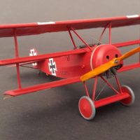
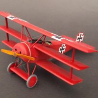
Eduard 1/48 Fokker Dr 1.
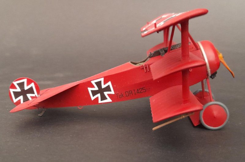
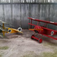
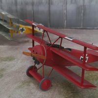
Eduard 1/48 Fokker Dr1 flown by Rittmeister Manfred Freiherr von Richthofen. CO of JG 1 , Lechelle France, March 1918.
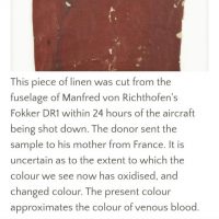
This is not the one he was shot down in and there's much conjecture regarding the red shade. I have a pic from the Australian War Memorial which I go to often, showing a piece of the Fokker Dr1 he was shot down in, so am guessing a similar shade for this, which is one of his other Dr1s. He had several. I've accounted for a freshly coated paint job on mine. I believe the fire engine red you see often is too bright, especially when you consider the red paint went over the factory standard streaked camouflaged pattern. I went with US insignia red which looks a little brighter in these pics than it actually is in real life. A fun simple build before tackling some difficult builds in the near future. Thanks for looking and for those who comment on my other builds. Much appreciated. ?
You have to love the classic Red Baron! Looks great.
Love the build and the color shade, Paul!
An excellent model overall!
Nicely done.
Perfect build, Paul.
Great paintwork.
Nice work again, Paul. I like this a lot.
Regarding the shade of red of the triplane he was shot down in, back in 2003 Dave Klaus did a decal release for MvR's triplanes (when the Roden 1/32 kit first came out), and the research was done by a Major Guy in the field (whose name I don't recall). He concluded that the airplanes were not covered in red silk at the factory (that was actually a theory for a good while), or specially painted over the CDL at the factory but rather that they were like all the others and came out with the streaky olive over CDL, then were painted red at Jasta II's base - and since the Germans at the time had a shortage of red paint (and yellow) that it was applied in a thin coat, that you could - from up close - "see through" to the camo below, which looked "blotchy" at a distance, and contributed to what the witnesses of the final crash called a "blood red" color. The thinness of the paint would also explain why the white square areas around the balkenkreuz is lighter.
At any rate, that was the information I used to do this, and people over the years have commented they think the color "looks right" even without me explaining the "secret."
2 attached images. Click to enlarge.
Thanks mate. Yes I agree with your thoughts and read your article before building.
I have the streaks underneath but it didn't show in the pics. I figure it's likely the same red paint was used in the field for this and the one you did. I guess we'll never know for sure, but yours definitely looks right to me too.
It's a very nice build of a decent kit.
Great job Paul! @paulwoodyvanacker That's the WWI plane to build for those with an aversion to rigging isn't it? 😉 I think the Red Baron would be right pleased with that bird for his mount! 🙂
Nice job !