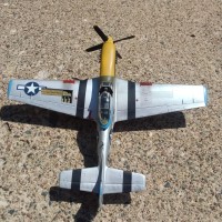
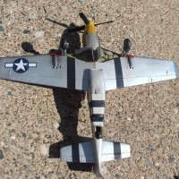
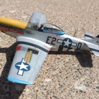
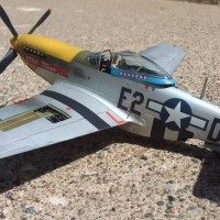
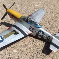
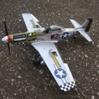
1/48 Monogram P-51D "Detroit Miss"
I bought this kit on the cheap from a popular online auction site. The finished product falls into the "6 footer" category. Stay 6 feet back and it looks like a P-51 Step a little closer and you will see the thick decals, poor fit, and my own mistakes with peeling paint.
I'm not entirely sure about the accuracy of the colors for Urban Drew's "Detroit Miss". Most depictions show red trim around the canopy and wingtips however, I dug around and found some interesting research that suggested that it may have been blue. To do something different I went with the blue and like the way that it looks. Feel free to chime in with your own thoughts if you have them regarding the color scheme of this particular aircraft.
Here is a brief summary of the build:
Highs- the cockpit detail and wheel bays are quite good, similar too or just a step below the Airfix kit in my opinion
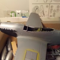
Lows- decals are pretty poor, the fit of the engine cover is so bad that almost all raised detail had to be sanded away. The windscreen fit was so bad that I had to cut out part of the fuselage and replace it with a spare windscreen from an Airfix kit I had in my spare box.
Overall it looks like a P-51 and I like the colors. Just stay 6 feet away.
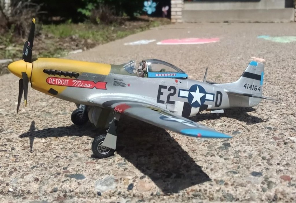
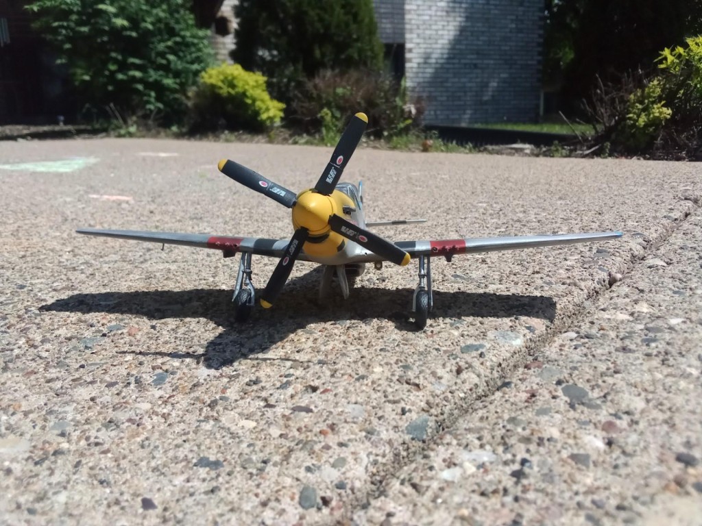
Looks beautiful to my eyes, David!
Well done!
Thanks Spiros!
Blue is right. The 361st's squadrons were the 374th, 375th and 356th. Drew was in 375th, the "second" squadron. Official squadron colors are Red - 1st, Blue (Azure/Ultramarine) - 2nd, and yellow - 3rd.
Surprise surprise, the International Poop and Moan Society "hex'spurtz" are wrong again.
Good to know that blue was correct in the end. I was hoping you would chime in on this one, there was lots of internet debate over on other websites!
Is this Azure/Ultramarine color offered by any of the paint companies for modeling? Wonder why after all these years the plastic, diecast and decal modeling companies continue to get Drew's P-51 paint scheme wrong? Too bad better photos (especially color) of his plane do not exist.
I used a 50:50 mix of Vallejo UK Azure and blue to get close. I did find one (and only one!) decal company- Kagero, that does show the blue paint scheme for their 1/32 collection. Although I used the kit decals I used the Kagero directions that I found online to guide me in the painting process
1 attached image. Click to enlarge.
Nice work on blending that lower engine cover in. Well done.
Thank you! sanding and putting erased nearly all of the raised detail but it looks better than the massive gap that was there. I appreciate the kind words
Looks fine from here, David @dbutlr
The open gun bay does add some nice details.
Good work on the canopy which looks fine now.
A great looking model David! I built that kit more than once back in the '70s & early '80s. A nice reminder to me of my youth! Monogram captured the look and overall shape of the Mustang as well as anything that is out there today. Thanks for posting this David! It brought back some very pleasant memories ?
glad you enjoyed it! It was a fun but challenging build
I was tickled to see your Mustang David @dbutlr. I think she looks fine! ? That model was about my fifth or sixth completion after returning to scale modeling as an adult. I vividly recall building it back in 1989. It is one of the very few models that I've never photographed at the airport, or anywhere else for that matter. My lower engine cover has a huge gap at the front edge and maybe that's why she's still a photo-virgin! Thanks for posting yours and thanks to @tcinla for the color correction...of course, mine has the red trim..d'oh.? ?
Thanks for the kind words Gary and the story of your experience with the kit. . . if your other posts are any indication of how your Mustang turned out I'm sure it's a winner! I am a big fan of your builds and photography- from one middle school social studies teacher to another 🙂
@dbutlr, You are so welcome David! And thank you for the kind words as well! Junior High is such a fun age to teach, isn't it? ? When I decided to become a teacher and returned to college, all of my observation time was spent in High School classes. But then I had the opportunity to do my student teaching semester in an 8th grade classroom. I loved it and after finding paying work, it was my career for 17 years. Thank you for your classroom service sir. ?
A fine-looking Pony in a really nice scheme! Well done.
Thanks Greg!
Looks great, David (@dbutlr). Old Monogram and Revell kits still build into nice models with just a little TLC. I think the paint and decals look fine. Well done.
Great results, looks fine!
Lines are really sharp where you taped off and the decal placement is very good. Love the light blue color!
Thanks Emmet!