New Project Update: 1/48 Vintage F-15A Eagle
This is a follow up to the following Article: https://imodeler.com/2018/10/new-project-vintage-tamiya-1-48-f-15a/
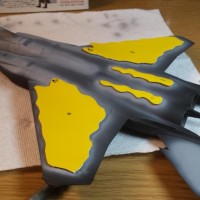
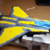
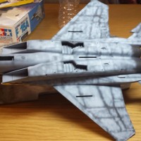
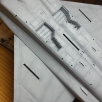
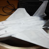
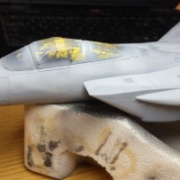
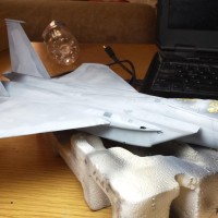
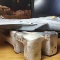
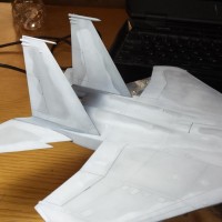
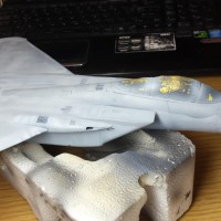
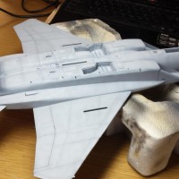
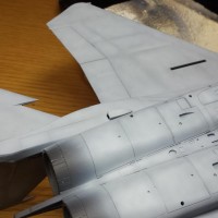
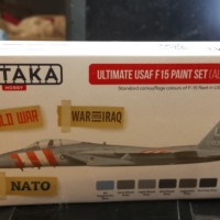
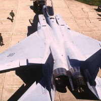
I have completed painting the 2-tone Compass Grey Camo using HATAKA "Ultimate USAF F-15 Paint Set". The basic 2-colors used from this set are the Light Ghost Grey and the Dark Ghost Grey. These were used over a Acrylic black primer. As the pictures illustrate I used multiple layers to build up to the final colors. A significant amount of pre-shading was performed using a mottled layer which focused on the panel centers leaving the panel lines mostly black. I also used some very thinned white to add depth and visual interest to the mottled effect. This was finally blended using a very thinned layer of the base paints allowing the pre-shading to subtly show through. I wanted a sort of patchy look commonly found on front-line USAF fighters.
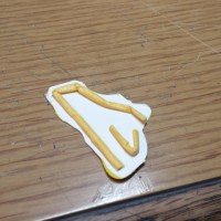
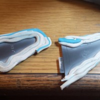
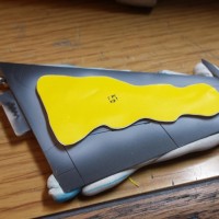
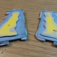
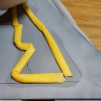
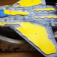
The 2-tone tone camo lines were created using after-market masks, masking tape, tamiya tape, and finally Blu-Tak snakes. The masks are produced by a small company called "AeroMasks" product number AM48-F1507US. These are pre-cut adhesive camouflage patterns which are applied to the model surface following the recommended sequence. Unfortunately these masks had issues. Many of the masks peeled up with a layer of the backing paper still attached, and this paper could not be removed. Although disappointing this was not a major issue for me. This is because the F-15 camo has soft, feathered demarcation lines between the camo colors. If you used these masks as designed you would get a hard line camo and this does not look right on this aircraft. I rolled up tiny pieces of tamiya tape and placed under the camo masks. This raised the edges of the masks to create softer lines between camo colors. I also used rolled blu-tak putty as needed in places that were difficult to apply the pre-cut masks. (See Pictures).
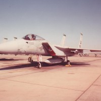
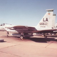
Overall I was happy with the outcome of the paint job. It was important that the 2-colors did not display a strong contrasting difference. When looking at the real aircraft wearing the early compass-grey pattern the 2-colors are barely discernible. Using the Hataka paints straight from the bottle I was able to achieve this accurate look. I did not need to modify the colors except for the application of pre-shade colors and the black-primer. Touch-ups are a challenge b/c you are now spraying over a more opaque layer of paint and so the touched up spots take on a slightly different hue, and brightness, then the original paint that was thinly sprayed over the pre-shading and primer colors. It does not look to bad in touch up places but instead looks like a real USAF aircraft which has had lots of paint touch-ups and paint re-do's.
The attached pictures are slightly lighter then the actual model due to the lighting used, but they are very close to the actual look. Please stay-tuned for follow-up articles for this build.

Nice tutorial, Paul. The layers are building up subtly and with just the right level of nuance. My take on this kind of thread is usually of the “making all the mistakes so you don’t have to” variety.
Great stuff.
Thanx David, glad you enjoyed it and thanx for your support!
That's some fantastic masking - I think raising the masks was perfect. And some subtle painting - it compares really nicely to the photos of the real thing! Many would have looked at the delicate nature of the scheme and decided on something else! Great job!
Needed to get the paint colors right on b/c this build is for a customer and he sent me many pictures of his jet from USAF. It was emphasized many times that the camo needed to be subtle. I am happy with the HATAKA paint line for getting the USAF colors right-on. I have had some complaints about other companies paints being way off over the past year.
Lotta "prep time", but it looks like it's gonna be well worth it. Lookin' good.
Hey Craig...thanx for comments and support. Prep time was not that bad. I have done this procedure many times recently and have it down to a place were I can move fairly quickly. Run the bench like an assembly line...Thank You Mr. Ford!
Paul, thanks for the behind the scenes on creating the two tone gray camo. The low contrast gray Compass scheme has always been a favorite of mine. I will be looking forward to further updates.
Thanx...hope to get more of this finished shortly. I tried to make article informative but not to bogged down in detail.
Paul, it sounds like a lot of trouble, but the proof is in the results - which are GREAT!
Bravo!
Jeff, looks like more work then it actually is. I have been using similar procedure often recently so I am getting quick at it and can move along at a good pace. I use to do a lot more to get same effects but I finally figured out what is needed and what I can skip. I think many expert model makers I read about go through many more steps in their attempts to achieve same results. I want a certain look but not to OCD about certain aspects...LOL!
Very nice, looks like all that time was well worth it. Great work.
Thanx so much Noah. Yes, I am fairly happy with outcome. It needs a few changes and some parts did not come out as well as other parts.
Liking it! I'm ready to start experimenting with some blackbasing such as you use. Hope my results are somewhere in the ballpark!
Go for it! Glad u like it. If I was to do this particular plane again I may not use black-basing, but instead maybe traditional dark pre-shaded lines. This is b/c it really changed the tone of this particular color paint. I did not notice how much until I went back to touch-up over the grey using same color paints. B/c I was now painting over a more neutral grey (not black) the colors looked like completely different colors. This made it very difficult to touch-up and blend and not really satisfied with these areas but nothing to much I can do at this point. I dont recall having this issue in the past with other colors over black-basing. The greys are so subtle that a small change has a huge impact. So just food for thought.